In my early days as a tattoo artist, I focused solely on executing client requests without much consideration for the overall aesthetics of the tattoo. Clients dictated every aspect of the design – what to include, where to place it, and the size. Some of these tattoos turned out great, but many… well, let’s just say they weren’t portfolio material. Even then, the difference between a visually appealing tattoo and one that wasn’t was clear. When I talk about aesthetics in tattooing, I’m not referring to which style is objectively “best,” but rather how to create a tattoo that is visually pleasing regardless of style or subject matter.
Beyond the technical skill of application, what makes a tattoo look good or, conversely, less appealing? And isn’t beauty subjective? While personal preference plays a role, certain qualities contribute to a tattoo’s overall aesthetic, ensuring the best possible outcome, irrespective of individual style.
When assessing a tattoo design, I objectively consider its “readability” and “fit and flow.” These two crucial elements determine how a tattoo is perceived on the individual as a whole. Often, we see the person first before noticing the tattoo details. If the tattoo’s shape appears awkward or if it’s too small, it might even be mistaken for a skin imperfection.
Tattoo Readability
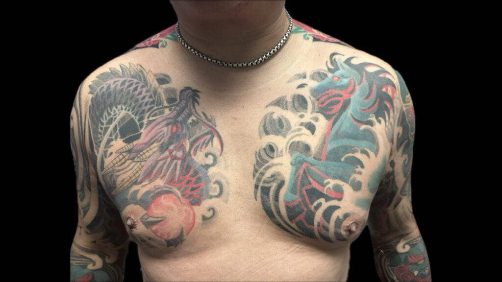 Bold chest tattoo showcasing Asian-inspired art, clearly visible from a distance, demonstrating excellent tattoo readability for body art.
Boldness and scale are key factors in ensuring tattoos are easily discernible from a distance. Can you immediately understand what you’re looking at? It might seem obvious, but the main subject or focal point of your tattoo should be instantly recognizable. I’ve encountered and created tattoos where a cluttered composition results in a confusing, jumbled appearance. Similarly, insufficient contrast can cause the subject to blend into the background. When evaluating a design, the subject should be unmistakably clear. For instance, if it’s an animal tattoo, viewers should be able to identify the animal without hesitation.
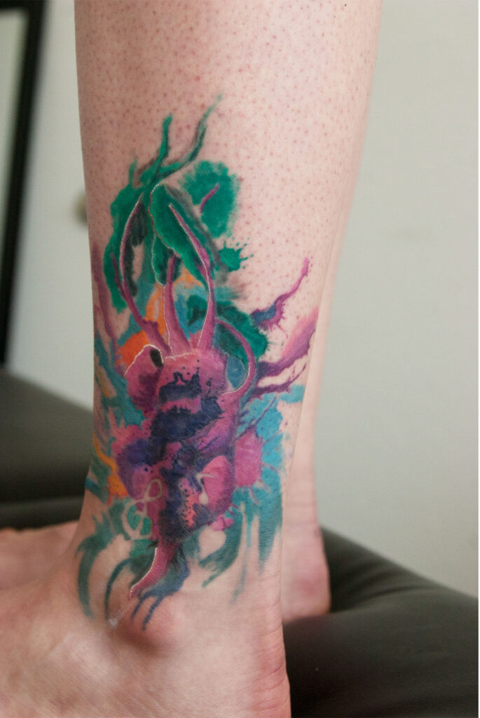 Watercolor beet tattoo with low contrast, making the subject difficult to identify against the splashy background, illustrating poor tattoo readability.
In the case of text tattoos, legibility is paramount. The lettering must be large enough to be read without straining the eyes. One client recounted how her parents mistook her tiny text tattoos for ants crawling on her skin. While subtle reminders or hidden messages can be appealing, they may become illegible from a distance. Furthermore, as skin ages and tattoos settle, small lettering is more likely to blur and lose clarity over time.
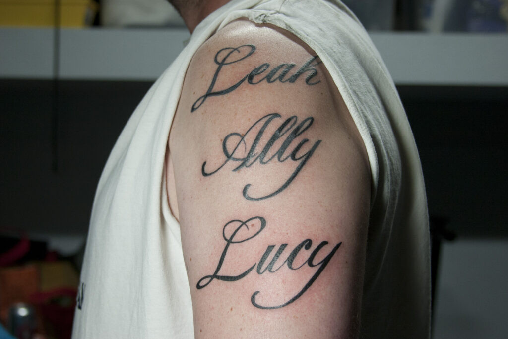 Legible name tattoos on arms, showcasing clear lettering visible even from across a room, highlighting good readability in text-based aesthetic tattoos.
Ornamental tattoos offer an exception to the readability rule. These designs prioritize abstract patterns and decorative elements to adorn the body rather than depicting a specific subject. In ornamental tattooing, the focus shifts to achieving excellent fit and flow.
Tattoo Fit and Flow
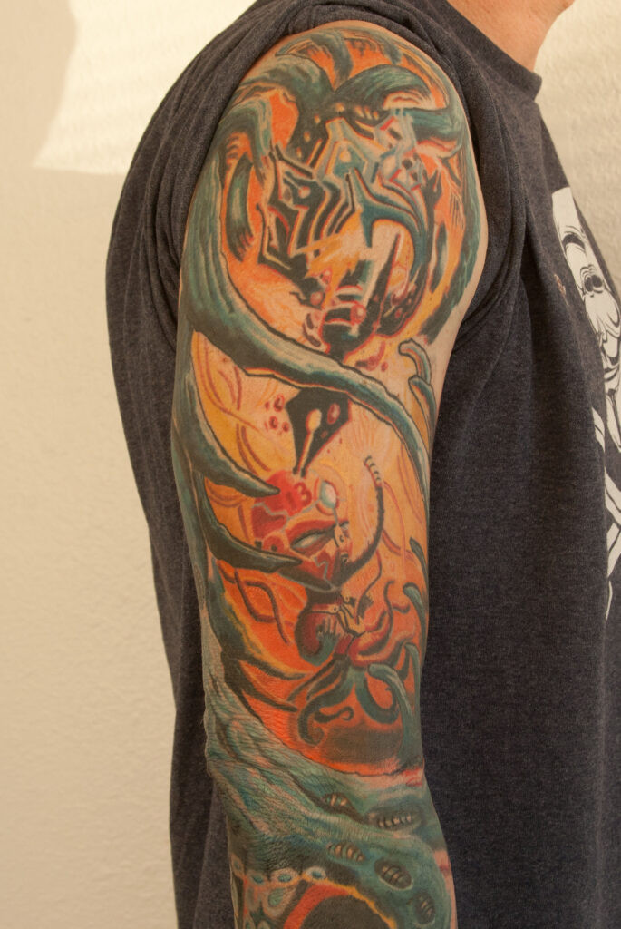 Biomechanical tattoo with flowing curves adapting to body contours, demonstrating excellent fit and flow in aesthetic tattoo design.
Does the tattoo complement the body’s shape and effectively utilize the chosen area? The human form is inherently curved and contoured, so tattoo designs incorporating curves tend to harmonize better with the body’s natural lines. Curves in a tattoo also create a sense of movement and flow, guiding the viewer’s eye smoothly through the design.
The “fit” of a tattoo relates to the overall shape language of the design. While individual design elements may be beautiful, their combination can sometimes result in an undefined, blob-like shape. It’s essential to ensure the tattoo’s overall form complements the placement area. For instance, a portrait-oriented design, being taller than wide, would ideally suit a body area with similar proportions, like the forearm.
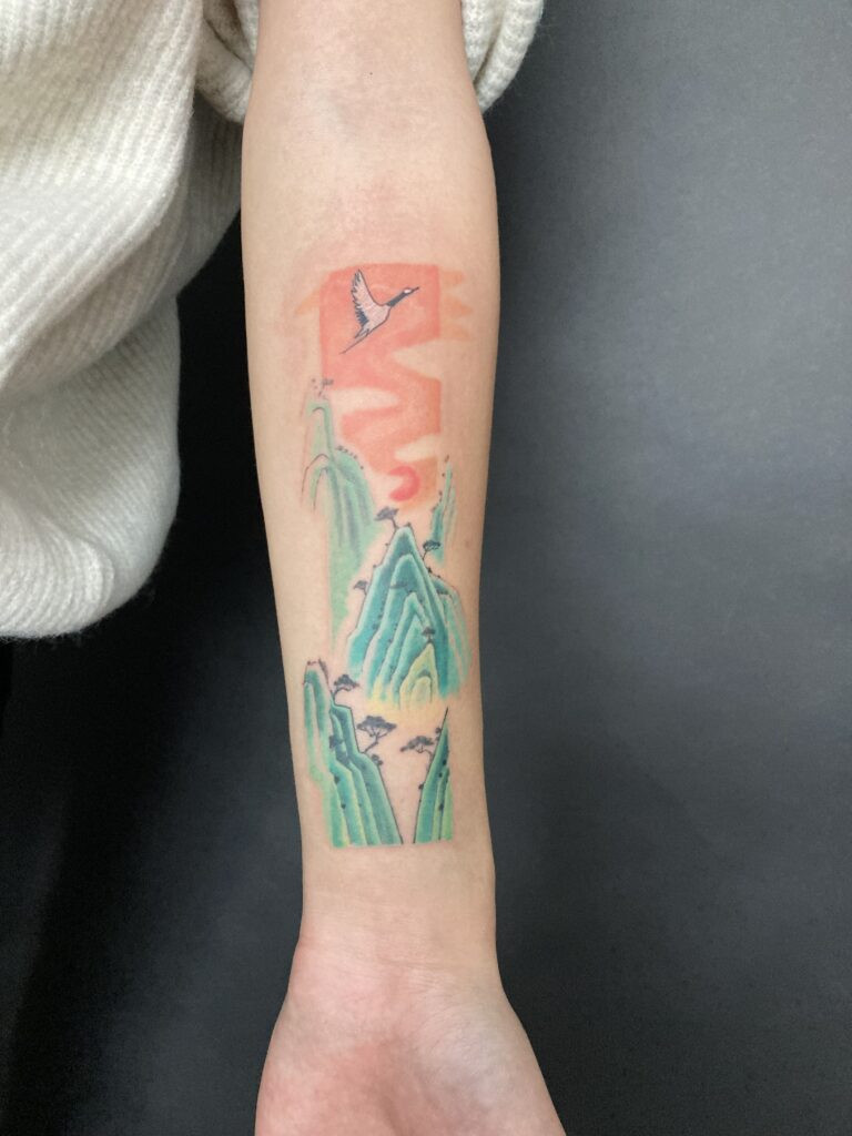 Rectangular landscape tattoo on forearm, demonstrating how the tattoo's portrait orientation complements the vertical space, enhancing aesthetic tattoo fit.
Beauty Over Meaning in Tattoo Aesthetics
Many clients prioritize personal meaning so strongly that they force specific imagery into their tattoos, even if it compromises the aesthetic appeal due to awkward shapes or compositions. While the personal significance of a tattoo is undeniable, it’s also important to remember that it will be visible to others. Ideally, when someone sees your tattoo, the reaction should be “That’s beautiful!” rather than “That’s… interesting?” or “What does your tattoo mean?”. Tattooing is a visual art form, an opportunity to enhance your appearance in a positive way. Of course, self-expression through tattoos is valid, but from an aesthetic perspective, looking good while doing it is a worthwhile goal.
Separate Your Themes for Better Tattoo Composition
It’s tempting to try and encapsulate your entire life story within a single tattoo, but it’s generally more effective to separate different themes into individual pieces. Consider it like arranging artwork in your home – you wouldn’t cram all your paintings into one room, would you? To prevent a cluttered, aesthetically overwhelming tattoo, try to distribute your ideas across multiple tattoos.
Tattoo Aesthetic Advice: A Starting Point
This advice serves as a foundational guide for evaluating tattoo ideas from an aesthetic viewpoint. Ignoring these principles won’t guarantee a terrible tattoo, but adhering to them will provide a solid framework for creating a more visually appealing piece. Ultimately, tattooing is about personal expression, and your own opinion is paramount. However, aiming for a beautiful outcome is a worthwhile endeavor, considering you’ll be wearing the tattoo for life. Discover more tips for getting your first tattoo here.